


Wine consumers do judge a wine by its label—whether they mean to or not.
—Kathleen Willcox
The decision to buy one product over another often seems mysterious—whether analyzing broad purchasing data patterns, or considering why you decided to grab one can of beans over the other while grocery shopping.
Indeed, many of these decisions are subconscious and not completely rational.
About 95 percent of all purchasing decisions are completely subconscious, according Harvard professor Gerald Zaltman, who wrote the book, How Customers Think: Essential Insights into the Mind of the Market. Around 93 percent of buyers say they rely on visual appearance when considering new products, with 85 percent saying color alone is the primary reason for buying a product. In fact, color alone can increase brand recognition by up to 80 percent, according to studies.
Feeling blue, seeing red, and going green are shorthand for a complex array of emotions, thoughts, and implied behaviors—all of which are instantly understandable and communicated with these few recognizable words.
The wine market is increasingly crowded, with the number of wineries in the U.S. alone surging past 11,000 at last count in 2020—a spike of 50 percent since 2009. Winemakers expend much of their energy creating a better, more evocative product, but even the best wine from the most incredible terroir won’t sell to its full potential if it doesn’t appeal visually to buyers who are unfamiliar with the maker and place it’s made. Which is where the marketing department comes in. By clearly and instantly conveying on the label—often through color alone—the brand philosophy, producers say buyers can weed out a fun party Prosecco from a terroir-driven organic Pinot almost without consciously knowing what they’re doing.
We reached out for insight from brands across the world to find out how they’re utilizing color schemes to communicate their brand’s story, message, and values.
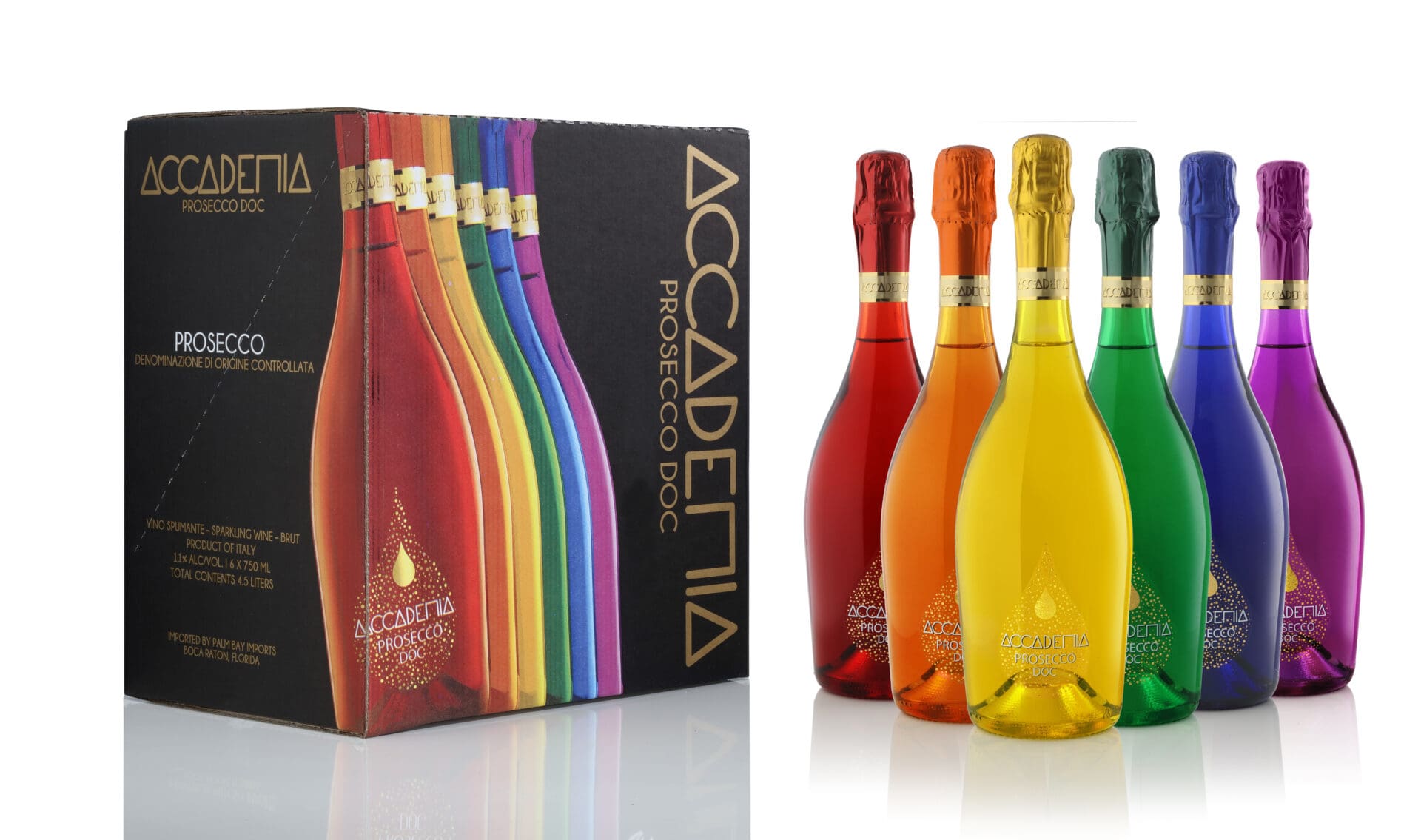
‘Pride, Diversity, Tolerance’
Bottega SpA in Prosecco, Italy links the craft of Venetian glassmaking and the brand’s embrace of diversity and tolerance through their Accademia Prosecco Rainbow Collection.
“The idea of the Rainbow collection was born three years ago to honor the rainbow of the LGBTQ+ community,” explains Sandro Bottega, president and CEO of Bottega SpA. The reception was so positive, they now use the six rainbow colors to create flag themes for countries and celebrate special holidays and events, from sports wins to Christmas.
Next year, Bottega forecasts sales levels of half a million bottles, up from 400,000 in 2021.
Environmental Stewardship
Wentworth Vineyards’ label is simple and stark: a black-and-white image showing a picture of a Redwood.
“We used black and white to succinctly convey our values and ambition,” says Mark Wentworth, co-founder of the Anderson Valley winery. “We see Wentworth as a vehicle for classic and elegant wines, and also conservation causes. These trees are a major source of inspiration to us personally and represent our core commitments to Mother Earth, organic agriculture, and family.”
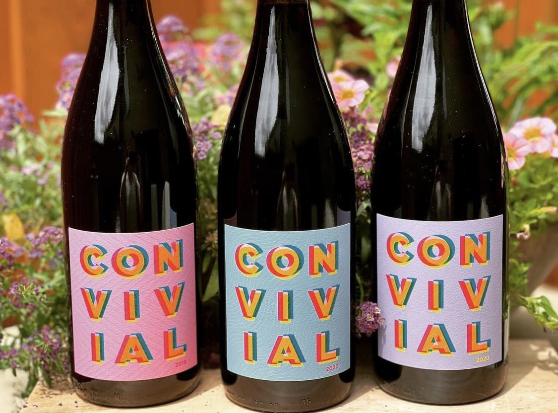
Vibrant, Engaging Energy
When Grochau Cellars in the Willamette Valley created a new line dubbed Convivial, winemaker John Grochau knew what the message he wanted to convey with color on the label, but didn’t know how to create, or even describe it.
“Graphic artist Jon Larson did a great job of decoding my limited instructions,” Grochau jokes. “We make our wines using a semi-carbonic fermentation technique that produces wines which are full of energy. The background colors and typeset are meant to show the tension and energy of the wines. The bright, effusive colors represent the varietals and flavors of the wines, with pink for the Gamay and Pinot Noir blend, because of the crunchy red fruits, blue for Barbera and deeper blue fruits, purple for Tempranillo because it shows its intensity.”
Heritage & Style
Liquid Farm’s roots may physically reside in Santa Barbara, but its metaphysical ones live in France. Through its labels, Liquid Farms aims to clearly demonstrate its heritage and stylistic goals.
“We used colors on our label to represent our French-inspired styles,” says winemaker James Sparks. “Our White Hill label incorporates green for Chablis, whereas a green hue defines the Chardonnay. Our Four label is dark gold, representing the higher-end nature of wine, made with more expensive fruit, high-end barrels in order to create a powerful, complete, small-production wine.”
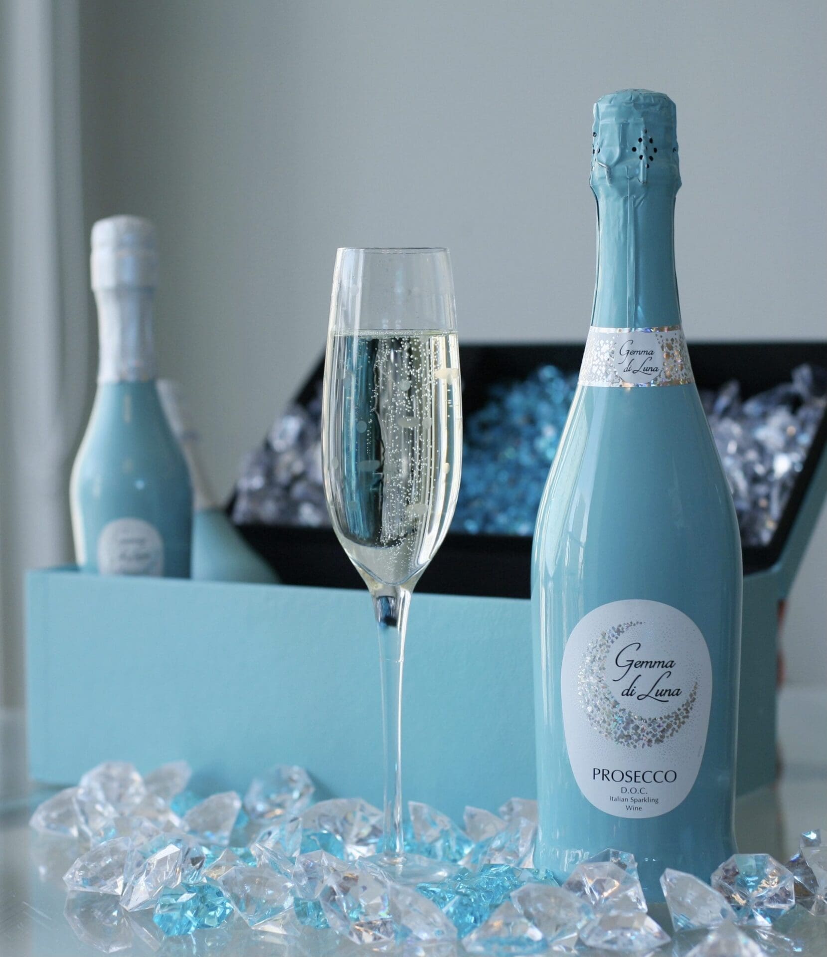
‘Tranquility, Clarity and Elegance’
Prosecco’s Gemma di Luna uses a particular turquoise hue (bearing a striking resemblance to the blue made famous by the emporium of aspirational luxe, Tiffany & Co.) to express everyday elegance.
“Teal was chosen for our Italian Luxury Collection because it combines the calming properties of blue, with the renewing qualities of green, and feelings of tranquility, clarity, and elegance,” Lisa Schuster, national marketing director of Enovation Brands, says. Consumers are buying the vibe, with double-digit year-on-year growth, to 137,000 cases last year.
‘Intensity, Authenticity, the Environment’
At Cellier des Dauphins in the Rhone Valley, winemaker Laurent Paré explains that all of their labels are meant to quickly reveal their inner workings.
“We want to make it clear that the wine inside our black-colored Intense labels are intense and powerful, with black fruit and spice notes,” says Paré. “The white on the Prestige labels is meant to communicate authenticity, prestigious terroir, and vineyards. And we are developing green labels for 2022 to demonstrate our commitment to sustainability and the environment.”
Cellier des Dauphins has become a benchmark producer in France’s Cotes du Rhone, and has become its biggest grower-owned producer, with more than 40 million bottles sold in 50 countries.
There is a lot of noise and competition in the increasingly frenetic competition for consumer loyalty. But as the 14th century English Franciscan friar William of Ockham explained in his frequently referenced analytic tool, Ockham’s Razor—sometimes the simplest answer, even in marketing, is the best.
Instead of focusing on complex multi-level selling strategies, producers may want to consider drilling down to the most elemental sales tactics of all. Simple, straight-forward colors show, don’t tell, what’s inside. Colors, in the simplest way imaginable, can share a complex message about the spirit in which the wines are made—and should be consumed.
______________________________________________________________________

Kathleen Willcox writes about wine, food and culture from her home in Saratoga Springs, N.Y. She is keenly interested in sustainability issues, and the business of making ethical drinks and food. Her work appears regularly in Wine Searcher, Wine Enthusiast, Liquor.com and many other publications. Kathleen also co-authored a book called Hudson Valley Wine: A History of Taste & Terroir, which was published in 2017. Follow her wine explorations on Instagram at @kathleenwillcox


